The Bowery
Men’s gentrification
NZ Best Awards - Finalist 2019
Our brief was simple. Create a brand for a range of mens premium grooming products. A simple brief needs a lot of hard questions though, so to start the process we asked our client about the intended consumer demographic and what was intrinsically unique about the products. The gem that came out of this conversation was that they were to be made in New York, which immediately gave us a unique angle to work with. This provenance story was pivotal, but it had to be conveyed in a very contemporary, edgy way-so that it would be relevant to design and fashion savvy New Zealand males.
The first part of the process was to research the competitive set within New Zealand and from around the world. This allowed us to gain an insight into the market, but also ensured that our design solution would be unique. Concurrently we also dived into the overall influences and drivers for our target market. This was not specific to mens grooming products though, it was more lifestyle encompassing to cover fashion, music and other relevant social trends. Once this exploration was completed, it provided us a consumer snapshot to base the new brand on.


Then came the fun part! Copious amounts of hours reading up about the history and culture of New York. There were various potential avenues that we identified going through this process, but the most interesting to us was a notorious area of the city called The Bowery. According to Theodore Roosevelt it was ‘one of the great highways of humanity. A highway of seething life, of varied interest, of fun, of work, of sordid and terrible tragedy’.
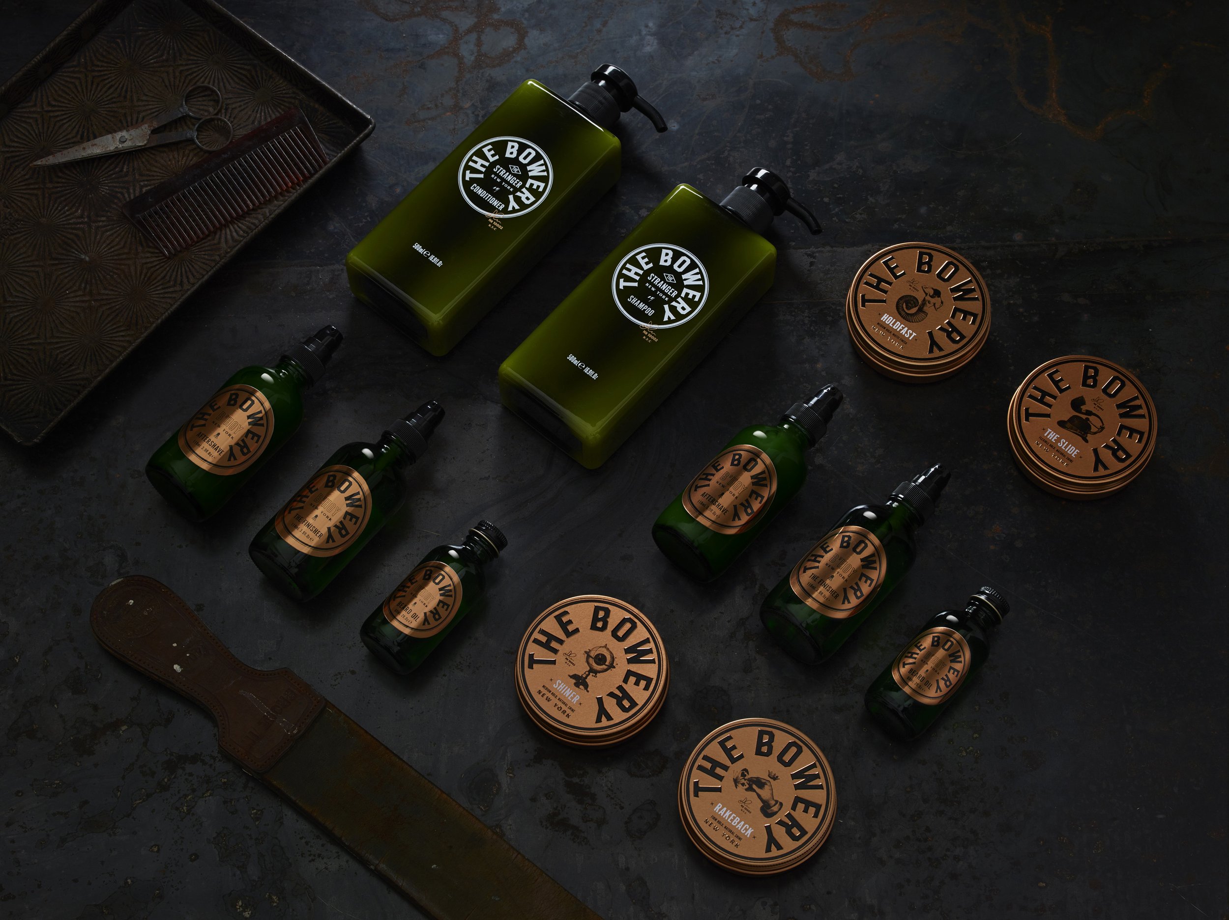
Colourful characters with alternative lifestyles have long been stitched into the social fabric of The Bowery, creating a culture of attitude that really resonates with contemporary life. Our goal then was to weave these people and stories into a relevant way for the brand. This is where the stars really aligned. All of the legends that we featured for the individual products allowed us to create names that had abstract links to the product benefits. ‘Shiner’, ‘The Slide’, ‘Rakeback’ and ‘Holdfast’ all have their roots in real Bowery stories, but also have context to hair styling techniques.
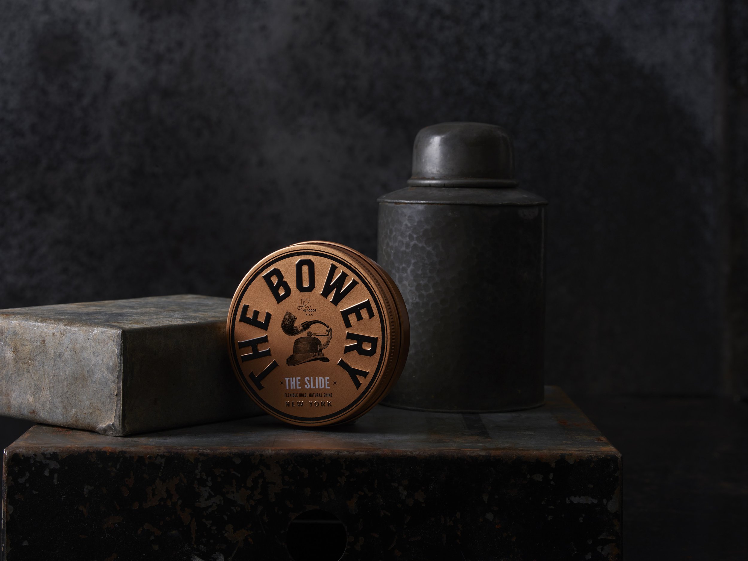
Finally we established a cool positioning statement of ‘mens gentrification’ that encapsulated the premium nature of the brand, but that was also a nod to the rise of the The Bowery district as a contemporary urban location. Once this strategy had been fully resolved, we then moved onto the design process for the master branding and the packaging. The oxidised copper tins for the packaging was a key driver for Curious, as it created the physical presence for the products. We then embraced the circular shape of the tins and determined that The Bowery branding should confidently integrate with the roundel.
The branding typography is strong, bold and masculine and acts as a counterpoint to the detailed illustrations. Victorian engravings were used a basis for those, as they exude tradition and premium values. However, we then added a layer of attitude and surrealism by montaging unexpected images together. A Dadaist technique of the 1920’s that celebrates the art of ‘random’. The final touch was applied by adding The Bowery zip code and the signature of the founder, Adam Johanson.
From a Curious perspective, this has been the dream job. Our client gave us a succinct brief about the range of products that were to be introduced, their origin, the target consumer and the premium positioning. After that we were allowed free licence to explore the strategy, the brand name and the design programme. This client trust totally empowered us to follow our intuition and create a challenger brand that is intelligent, creative and on-point.
